Monday, April 30, 2012
From The Sublime...
Monday, April 23, 2012
Creating A "Real" Scrapbook
The photo second down on the right is the one I´ve just finished restoring. All the others were edited some years ago and in each case I´ve shown both the original and the restored version though this very small format camouflages the worst of the wear and tear on the originals. I thoroughly enjoyed creating this page though it´s not all my own work. As you can see, I had a helping hand, not to mention an eraser to correct my mistakes as I went along. I think that by now you´ll have gathered that a cup or three of strong coffee is essential to the creative process and is usually accompanied by some drips and splashes so I´ve replicated these too. Now, quite literally, back to the drawing board...
Creating this kit is going to be so much fun!
Sunday, April 15, 2012
Vintage Whimsy Is Now In The Store.
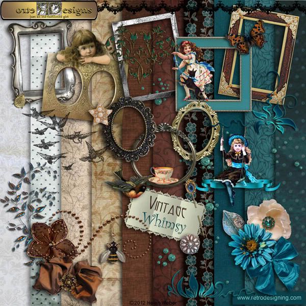
Here´s the preview of my latest kit, Vintage Whimsy. As with all my heritage kits it´s a mixture of old and new, vintage and modern and, as always, with a sprinkling of bling and precious stones.

Click on image for a larger view. Click back to return here.
I´ve just released Vintage Whimsy and it´s now available in my store. You´ll find more info about it and other kits plus a new kit freebie HERE.
And talking of bling, I´ve also released a favourite of mine, Floral Bling. Any of these flowers would add an eye-catching accent to any heritage or floral page.

Thank you for looking.
Thursday, April 5, 2012
Distracting The Baby
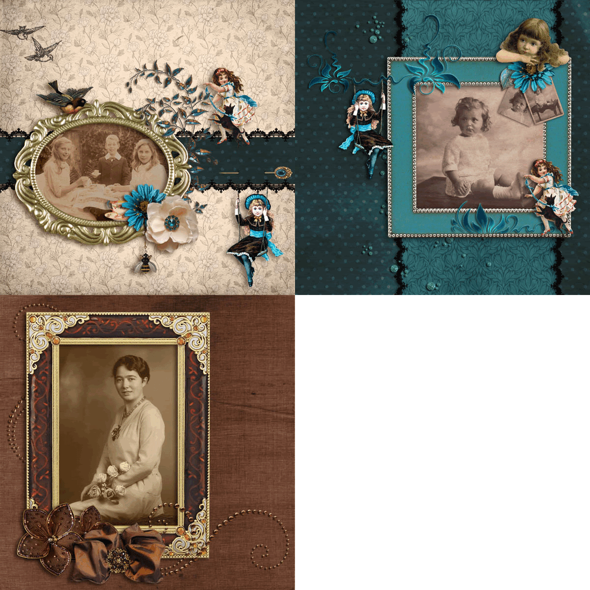
The thing that struck me when I first saw this photo – apart from its battered condition - was the expression on that poor baby´s face, and after all those years I can´t quite define it even now that I´ve removed the blemishes which partly hid it from me. It´s not exactly fearful and it´s not exactly pouting but it looks to me like the lull before the storm and I can well imagine that she probably burst into tears the very moment after the shutter clicked. She´s obviously not looking at the photographer so I can only imagine that the look is directed at her mother. Maybe it´s an appeal for help which says, “I´m being a good girl and sitting as still as I can but I can´t keep this up much longer.” So I thought I´d try to distract her from the ordeal by giving her something fun to look at, but showing her the girl on the swing doesn´t seem to have done the trick. Maybe she´ll cheer up when the girl with the dog runs past her. Hmm. But then again, maybe not, and the pensive child clutching those original defaced images seems to be entirely in sympathy with her.
I created this whimsical page using mainly the teal, blue and turquoise elements in my new kit which is a heritage kit with a difference in that it´s possible to use it for either elegant or playful layouts, hence the name Vintage Whimsy. I´ll be releasing it soon and I hope you´ll like it when you see the previews.
Monday, April 2, 2012
Tante Anna
Anna was the oldest of the four Schwerdhöfer sisters of whom the second youngest was my husband´s mother. I never knew Anna and know very little about her apart from the fact that she was born in Marktheidenfeld in Bavaria and died in Mainz in Rheinland-Pfalz at the age of 89. As for the age of this photo, it´s difficult to be exact about the date, but judging by the hairstyle and the dress which doesn´t have a dropped waistline, I originally guessed it was probably taken during the early 1920s. My husband thinks that Anna died about 25 years ago which would mean that she was born around the end of the 19th century so my guess is probably pretty accurate. I´d even go so far as to assume that this lovely studio portrait may have been taken to commemorate her 21st birthday. It´s obviously a special occasion anyway as she´s decked out in all her finery and wearing some beautiful jewellery and she´s certainly looking a lot less solemn than the subjects in most of the studio photos I have from that era. I think this is a perfectly beautiful photo and it´s still in such remarkably good condition that no restoration was necessary, thank goodness!
The kit I´m working on at present is mainly in warm sepia and cool teal with cream, gold and silver accents. I´ve used mainly the warmer shades for this page with a little pale gold and silver to echo the colour of her dress and the artificial roses she´s holding.


