just an old-fashioned girl

Hello and welcome. I'm glad you dropped by. If you´re looking for something a little nostalgic of bygone eras with a timeless elegance and a little modern twist – in other words, something slightly “retro” – then you should feel right at home here in my shabby chic room. Month by month, there will always be something new to see so I hope you´ll enjoy your stay and come back again soon.

Showing posts with label brown. Show all posts

Thursday, February 6, 2014

Getting Started Again

It´s been a while since I designed a new kit, so long in fact that I was beginning to think that Nostalgic Scrapbook was my swansong. Being in constant pain isn´t exactly conducive to creativity and the sudden death of a family member lowered my spirits even further. However, just recently I´ve been having osteopathic treatment, mostly for the persistent headaches I´ve suffered for over a year and I´m feeling a lot more optimistic. The headaches haven´t gone completely but at least they´re not as frequent as they were and I´m not constantly reaching for painkillers.

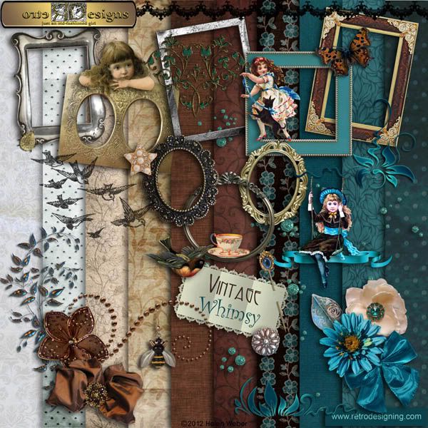
Getting started on a new project wasn´t really a conscious decision. As you may have noticed, I´ve restored several old photos over the past year. I thought it was about time that I gave them a suitable setting and that´s really what started me off again.

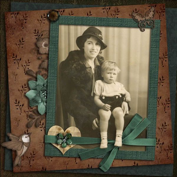
You may remember this photo of my grandmother and my aunt. It´s a particular favourite of mine and I thought it deserved a layout all its own so instead of using an existing kit I started to design something around it.

 
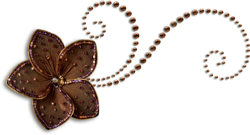
In a way it´s strange that I´ve gone back to shades of brown again. You probably know I really don´t like brown, mostly because it´s a colour I absolutely can´t wear, but I do like teal a lot and I can´t think of any other colour which brings out the beauty of my favourite colour better than brown. What do you think?

Sunday, March 20, 2011

Aversion To Green

With St. Patrick´s Day in the recent past maybe now´s not the best time to admit that I don´t like green. I´m not sure why this is, maybe because there are so many shades of it which make me with my Nordic complexion look - to quote an expression of my mother´s - "like death warmed up." My husband, on the other hand, looks great even in bottle green, a particularly unpleasant colour to me, but then he has green eyes which probably explains it. Brown is another colour that´s never appealed to me. Ditto the quote from my mother. Again, it suits my husband which is annoying because it means I can never borrow his sweaters. So, given my aversion to these colours, isn´t it strange that I should choose to create a green and brown kit? Well, the answer is I didn´t. Choose, I mean. It just sort of happened. And this isn´t the first time either. I can think of several green/brown kits in my collection including my most recent as you can see for yourself.

This is a kit that started off grungy brown and then took on a life of its own when it told me it needed something to relieve the drabness of all those earth tones. The obvious choice was, needless to say, green. I´ve also livened it up with a little bling so that what started out rather grungy has ended up a lot more elegant than I´d originally intended! I´ll post the previews soon and you can judge for yourself.

The above photo is one of many found in an attic by my cousin, Neville, and shows himself and his mother in what is obviously a studio portrait. Judging by that pout he was none too pleased about it and there only under protest. Maybe the photographer should have captured his interest by saying, "Watch the birdie" as my dad always did before snapping us children. I´ve added the "birdie" but far too late to change that petulant pout.

This was, and still is, a very spotty photo though it was a lot worse when I first got it. It still needs a lot of painstaking work with the PS healing brush/clone stamp tools though in this small format its most glaring defects aren´t so apparent.