
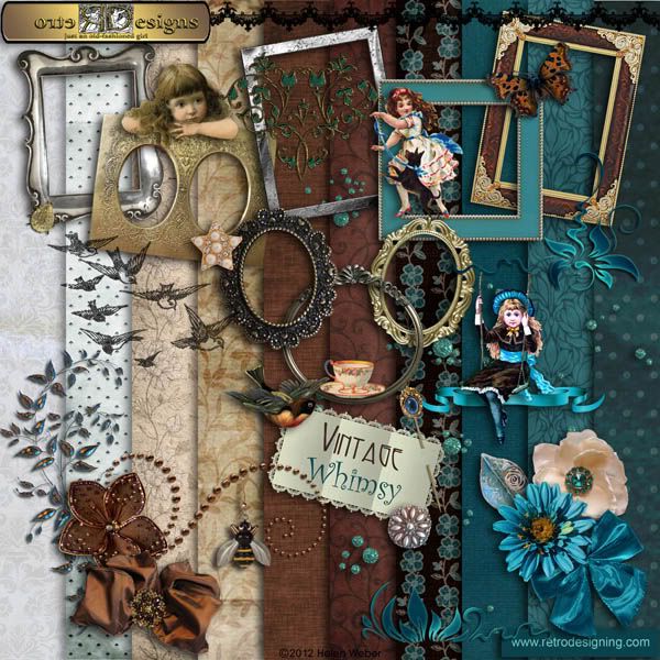
 This is a kit that started off grungy brown and then took on a life of its own when it told me it needed something to relieve the drabness of all those earth tones. The obvious choice was, needless to say, green. I´ve also livened it up with a little bling so that what started out rather grungy has ended up a lot more elegant than I´d originally intended! I´ll post the previews soon and you can judge for yourself.
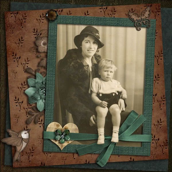
The above photo is one of many found in an attic by my cousin, Neville, and shows himself and his mother in what is obviously a studio portrait. Judging by that pout he was none too pleased about it and there only under protest. Maybe the photographer should have captured his interest by saying, "Watch the birdie" as my dad always did before snapping us children. I´ve added the "birdie" but far too late to change that petulant pout.
This was, and still is, a very spotty photo though it was a lot worse when I first got it. It still needs a lot of painstaking work with the PS healing brush/clone stamp tools though in this small format its most glaring defects aren´t so apparent.


This is an awesome layout especially the way Neville's legs are hanging over the ribbon. You did a terrific job restoring the photo.
ReplyDeleteIt's funny that you don't like green and brown especially since you're such a nature lover. They happen to be two of my favorites so I just love what I've seen of this kit. :o)
Green and Brown were never my favorite colors either, so I completely understand where you are coming from. I think I read in a book somewhere, some time, that people who wear brown are trying to "hide". I am finding as I get older that I like the colors a little bit more. Maybe I want to hide ... or maybe they are colors that we grow into as we mature.
ReplyDeleteAs far as borrowing your hubby's sweaters goes, if you tie a scarf around your neck with a color you look good in, you could get away with it! :)
I love the page you created, and I agree with Diane, hanging Neville's legs over the ribbon really made the page special! You did a great job on the restoration of the photo! The kit looks fantastic, and I can't wait to see the rest of it! You are SO TALENTED!
It is surprising you don't like brown as it plays an important part in many of your kits! Green is a different matter. It has many different moods depending on the type of green. I know you are careful of the ones you use. I too enjoy the look of Neville's leg extending from the photo. You do that so well. The bird is a new look, really too bad it wasn't there for the original.
ReplyDeleteAs for wearing colors, now that my hair is gray (hopefully silvery like my father's was) I wear a lot more blue than I ever did before and not nearly so much of the really warm colors that looked nice with dark brown hair.
Love this photo...pretty lady and Neville's expressions shows that children are the same over the decades. They are not always smiles and giggles...they have their moments! It's interesting that brown isn't just brown...there are many shade and same with the greens. Love your choice of shades for both colors. Loving this kit...looking forward to it's completion!
ReplyDeleteOops my co9mment seems to have disappeared. Great layout Helen, love the kit. And you must love green a little bit, after all you chose a man with green eyes. Green is my youngest grandson favourite colour and I am about to make him a cake with green icing for his birthday.
ReplyDelete